

Branding Identity, Product Design, Crafting
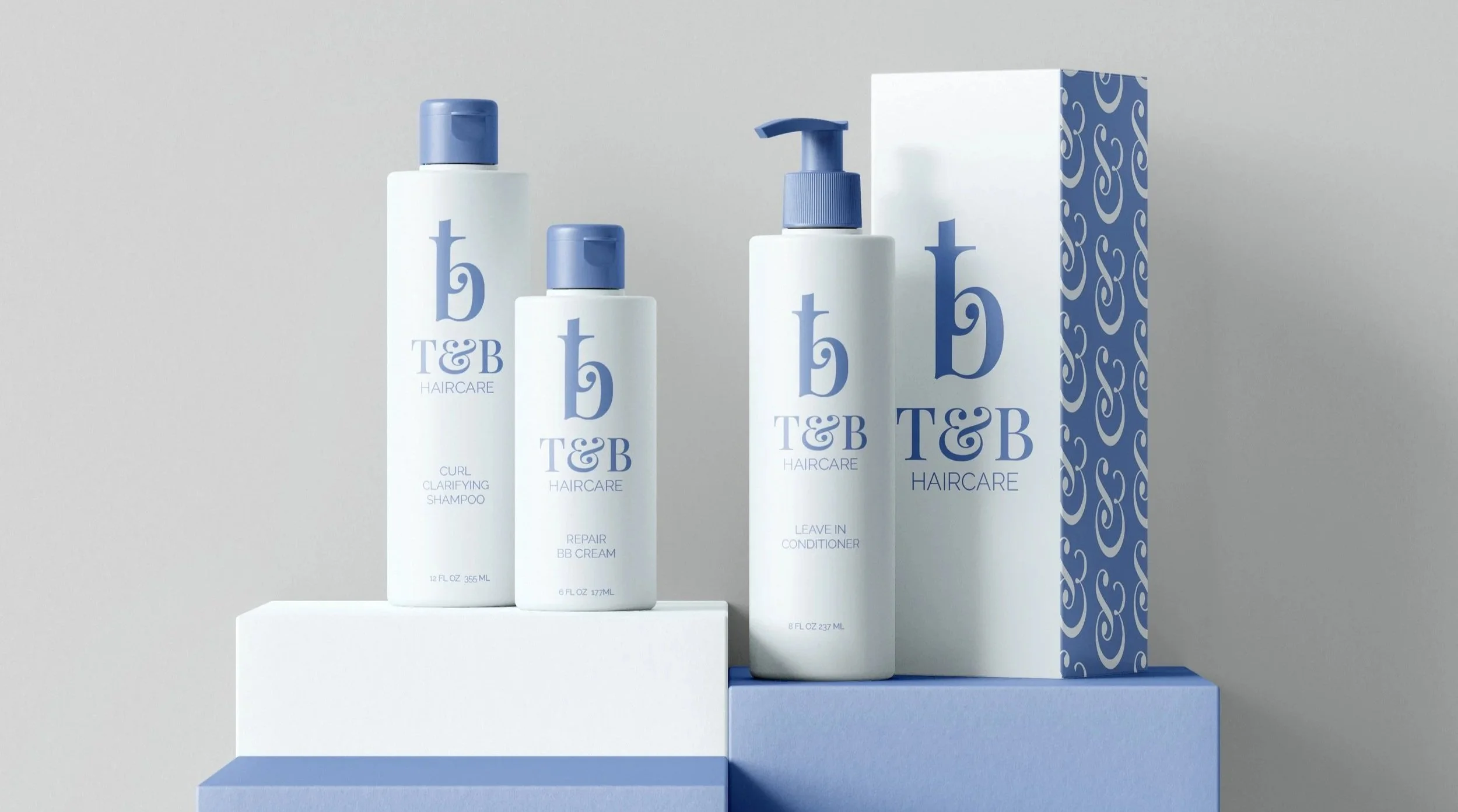
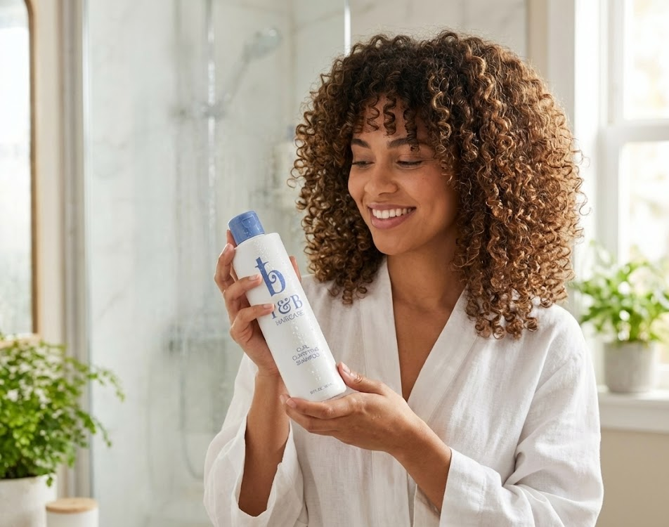
T&B Haircare delivers convenient, travel-size hair products tailored for women with busy, on-the-go lifestyles. These compact, travel-size products make it easy to care for your hair anytime, anywhere.

When designing my brand, I was inspired by the aesthetic of Greece and the movie “Mamma Mia”. The brands markets towards young women, who have the freedom and ambition to travel the world. The product is to allow women to feel confident and looking their best all while doing something they love. The brand’s visual identity draws heavily from the architecture, colors, and patterns of Greece.

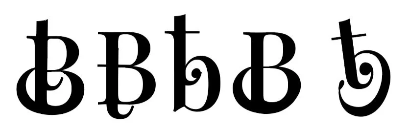
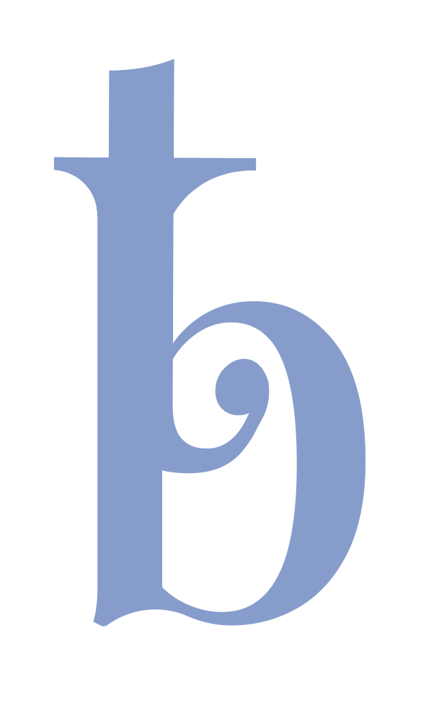
The font I chose to represent my brand was “Playfair Display”. Its’ elegant and classic style, which aligns with the inspiration drawn from Greek architecture and patterns. The font's refined serifs and high contrast reflect the beauty seen in Greek designs and also complements the rounded lines and edges I used in my logo sketches. Playfair Display offered the clean and simple aesthetic the brand needed. Its versatility allowed me to overlap the letters "T" and "B" effectively, leading to the final design that is both elegant and representative of the brand's core values.
Something else that really stood out to me with this font was it’s illustrated design for the symbol “&”. When looking at this symbol, it really reminded me of curly hair. I ultimately used this symbol to create my own pattern and bring the whole brand together.


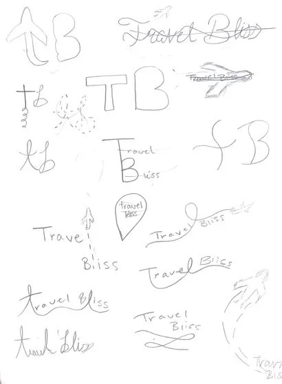
With my chosen letters “T” and “B”, I sketched a variety of different logo variations. I focused on rounded lines and edges, to resemble the curves of Greek patterns and architecture. Many of my sketches incorporated details referencing planes, reflecting the travel care focus of the product. However after lots of ideation, I steered away from that.
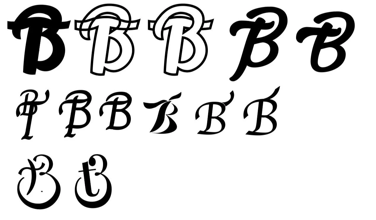
I ended up taking a few of my ideas into Illustrator to play around with the different forms and emphasize on some more of the curvatures . Though I liked these designs, I really felt that the brand needed something more clean and simple. That’s when I started to play around with different fonts. Using the letters “T” and “B” I was able to overlap the characters until I eventually came to my chosen design.
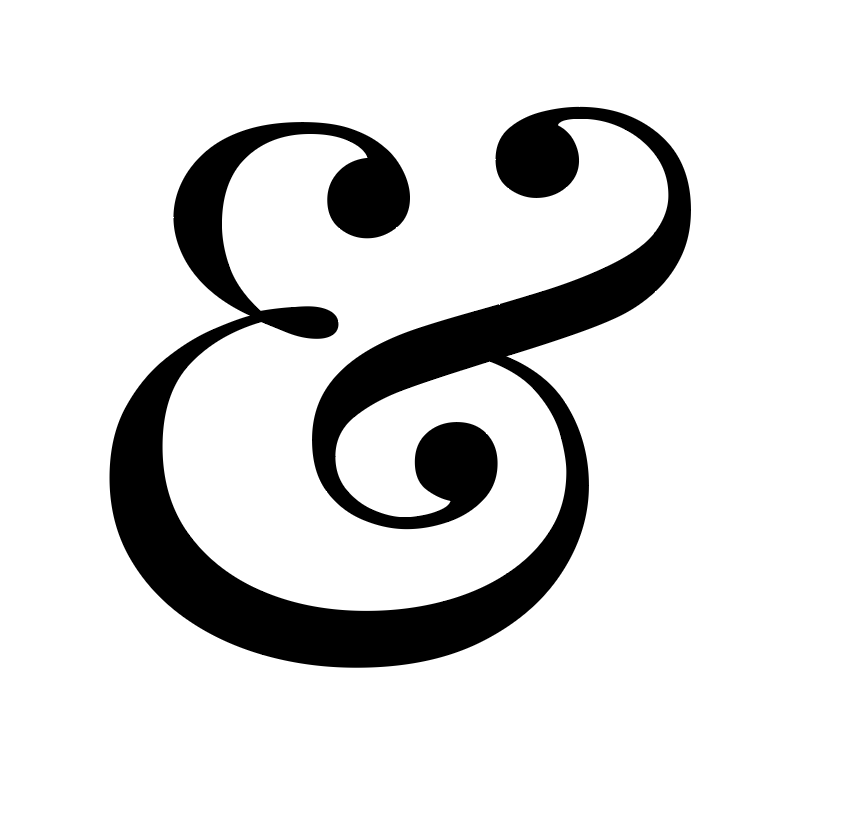
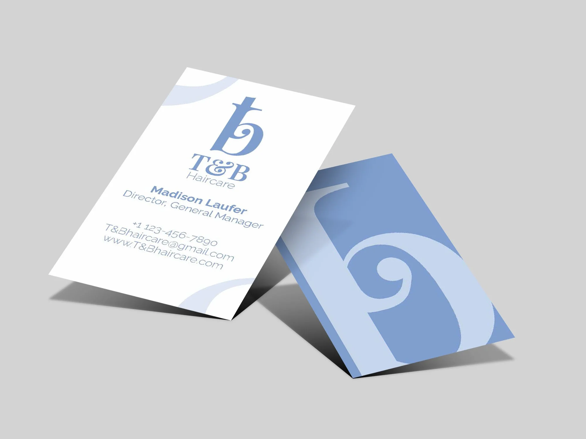
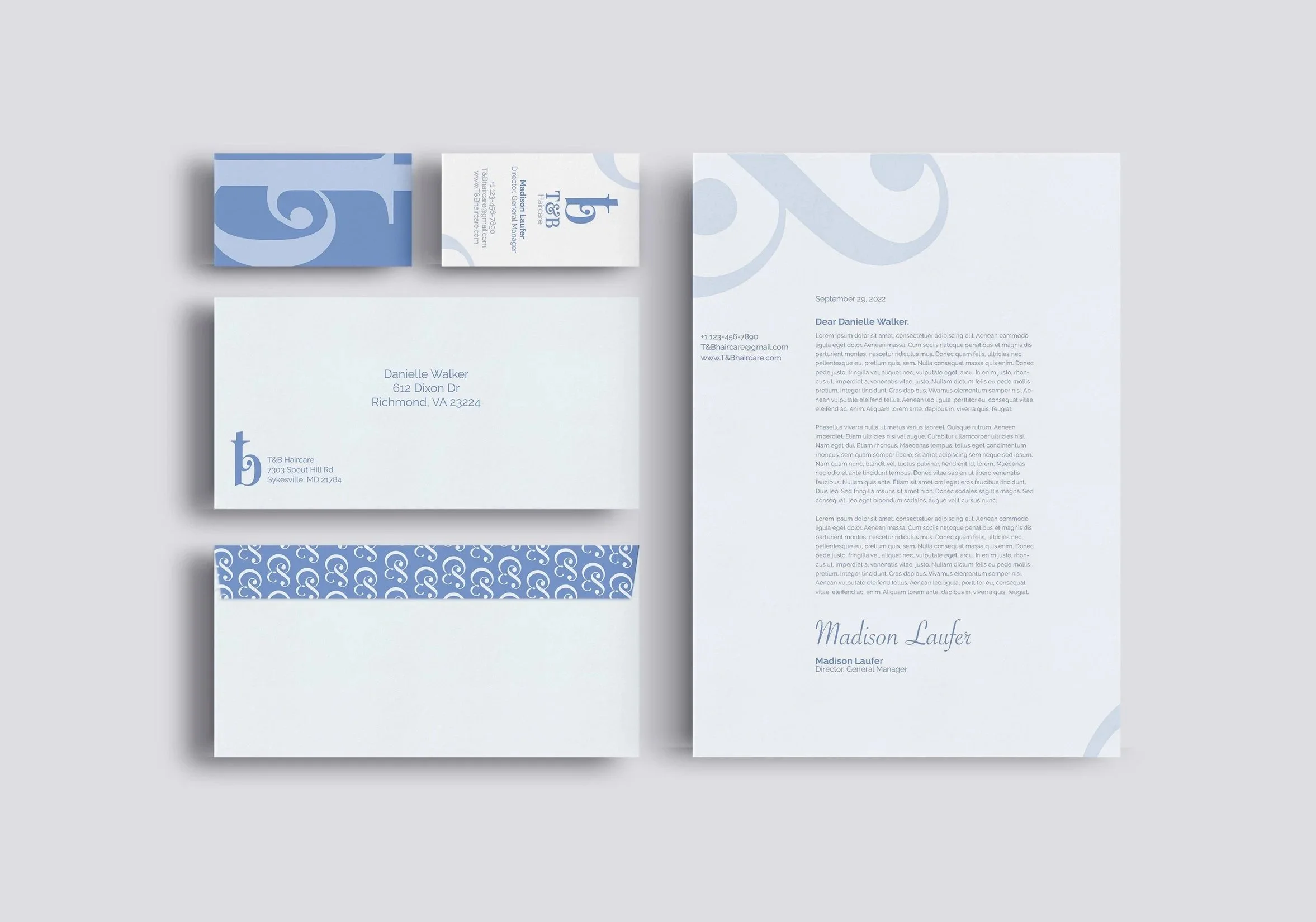
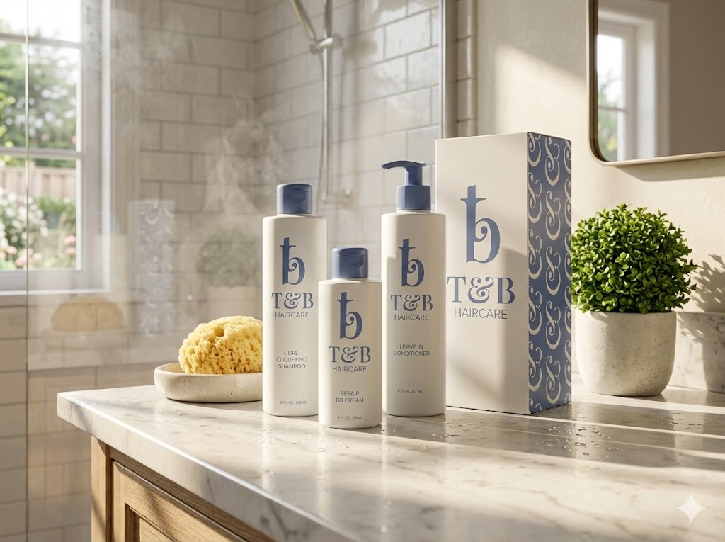
The deliverables for this project include a business card, letterhead, envelope, and bottle/box design. I focused on incorporating the forms and curvatures as key design elements across these pieces to ensure a cohesive look. Drawing inspiration from the Playfair Display font, I used its distinctive ‘&’ symbol to create a unique pattern that represents the brand's identity. This pattern is featured prominently on several of the deliverables, adding a consistent and elegant touch to the overall design.
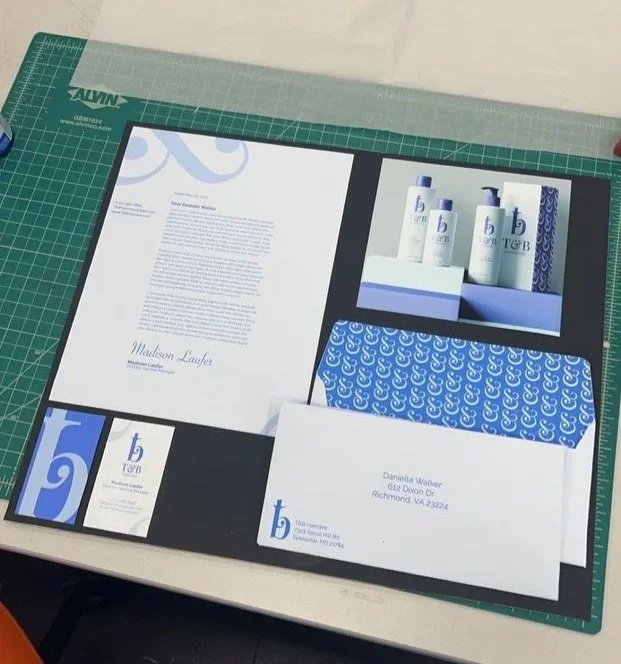
This project required me to create both life-sized, crafted versions of the deliverables and their corresponding mockup designs. This approach allowed me to fully bring these pieces to life, showcasing the designs in a tangible, hands-on way.